A piece by our Designer and Creative Director, Rachel Cunliffe.
MailChimp recently updated its branding and website design. What caught the eye were the font treatments: big, bold, crisp and black, the words seemed to jump off the page. They were also much easier to read.
Whether you read on your phone, tablet or laptop, the vast majority of us are glued to our devices. Reading online, while convenient, also has its drawbacks.
The flickering light can cause eye strain and headaches, and reading small text becomes exhausting. Which is why it’s important to optimize website text for reading – something most people don’t consider, but good copywriters and web designers do.
Text that’s been well-designed for reading does two things: It makes it easier for buyers to view what you have to say without strain, and two, it gets your message across because . . . people are reading it and understanding it. When comprehension goes up, so does taking the next step in the sales process (e.g. contacting you).
In addition, legible font sizes is one of the over 200 signals that goes into Google’s ranking algorithm.
What follows are a few of the items good designers take into consideration when optimizing website text for ease of reading.
Text Size
Google recommends having a font size of 12px for at least 60% of text on a page.
A font this size means you can comfortably read the text without having to pinch-to-zoom or bringing the phone close to your face.
Font sizes can also be too big. When this happens, you’re forced to scroll too often on a smaller device in order to read a paragraph.
Text Color
In the early 1990s, Colin Wheildon published Type & Layout: Are You Communicating or Just Making Pretty Shapes?
The book was remarkable because Wheildon used research and eye tracking studies to prove that most of the print advertisements of his time were simply unreadable – and thus did nothing to help sell products.
One of the many studies he conducted was on text color. He showed, through testing, that when a black font was used, more people readily retained what they read, and that the lighter the font, the less they retained.
It works the same for web pages. The darker (and blacker) the text, the easier it is to read.
Designers also need to account for color blindness, contrast with background colors, and differences in color display from screen-to-screen when selecting text colors.
Fonts
The web differs from print in one huge way: not everyone will see text exactly as you intended it. Different screens, and individual device settings and preferences, mean fonts won’t look the same for everyone. Designers check that the fonts themselves are readable.
Fonts should be crisp, not jagged or blurry, and have a good weight and proper spacing so they’re readable on a variety of devices.
Line Length
Classic readability theory suggests the ideal column width, for ease of reading, is 70 – 80 characters per line (about 8 – 10 words in English).
When the line length is too long, you have to move your eyes (or even your head) too much – which quickly becomes tiring.
When line length is too short, it’s especially hard for readers on phones because they have to scroll down the page too often and can’t take in the text at a glance.
Line Height
Ever read text where the lines were all crammed far too closely? This type of design makes for a tiring reading experience because your eyes have to work harder to follow where you are in the text, without getting distracted by the lines above and below.
Designers generally set line heights somewhere between 120 – 150% of the font size. There’s even a golden ratio mathematical formula for how to best space out text!
Choosing a design firm
As you can see, many factors go into ensuring website text is optimized for comfortable reading.
When selecting a web design firm, look closely at how easy it is to read the text on the websites they’ve designed in the past, both on your laptop and phone.
When working with a web designer, be vigilant in checking everything is easy to read. Speak up if something looks too small, too light, or simply “unreadable” to you.
Web Typography Do’s and Don’ts
DO use smaller or “chunked” paragraphs of one to three sentences. Long paragraphs are difficult to read online.
DO use subheads, bullets, and other elements to help people quickly find the information they’re looking for.
DO check your web pages on a phone to ensure you can easily read the text without having to “pinch” it to make it larger.
DO have multiple people proofread your content before making it live – it’s easy miss typos.
DON’T use all capitals for paragraphs of text (for headers and sub-heads, it’s ok). Text in all caps is considered rude and the equivalent of shouting at someone.
DON’T underline words that aren’t linked to something else as this confuses site visitors.
DON’T italicize text as it’s hard to read. If you need to emphasize a word, phrase or sentence, bold it.
DON’T use small (less than 12 px) text or very large (greater than 16 px) text for paragraphs as both are difficult to read, especially on smaller devices.
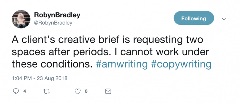
DON’T use a double space after periods. It’s not necessary. The extra space creates “rivers of white” on the page – and drives copywriters and designers insane.

