

Having worked with professional designers, photographers, artists, etc. for over 25 years, I’m not a fan of Gen AI. It’s just plain ugly. Plus, it doesn’t adhere to proven design principles.
But I get why people use it. One, “It’s free!!!!!!” and two, “It took us only two minutes to create!” Both can be compelling reasons for companies with limited budget, no in-house staff, or lack of vetted professional resources.
When an organization posted this graphic to LinkedIn, it caught my eye immediately. Maybe you can see why. (We removed the company name.)
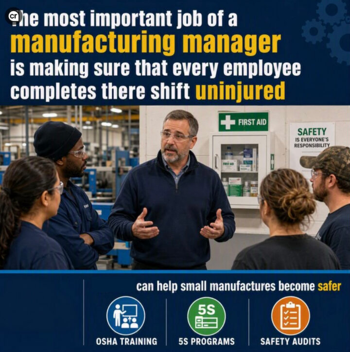
Did you catch the two typos? Look closely.
“There” should be “their,” and “manufactures” should be “manufacturers.”
In addition to detracting from the company’s brand, the typos also reinforced a negative narrative about skilled technical workers — namely, they’re not that smart because they lack shiny four-year college degrees.
To their credit, the company removed the post (several hours after I pointed out the “manufactures” typo), fixed both, and then reposted it.
We redesigned the graphic to prove a point
After some discussion with our designer Rachel Cunliffe, I rewrote the copy with the following changes:
- Reduced wordiness
- Changed the focus from “we” to “you”
- Removed “uninjured” because it’s hard to read and clunky
I then gave it to Rachel and had her work her magic. My response when I saw her makeover: “Oh my goodness, Rachel, that is 100x better. So clean. With all the slop now, you forget how wonderful good clean design is — and good copy, too.”
The “After”

Several things make this redesign stand apart from the Gen AI one:
The calming font — Without the large bold lettering and the yellow words, the message is now in focus — making it much easier to read.
No clutter — One problem with Gen AI is that it loves clutter, including icons, too many words, and butt-ugly fonts. Clutter is distracting, period. For this graphic, the AI included gears in the right hand corner of the header, and the three icons in the CTA. Rachel removed all of it.
Clear call-to-action — The point of this graphic / LinkedIn post was to get people to sign up for safety programs. To be effective, CTAs need to be straight-forward and easy to understand.
New image — Rather than use an AI generated image, we found a premium photo from iStock. Cost: $33. (iStock also doesn’t accept any AI images.) We could have also asked the company if they had anything original in their files we could use.
We also kept asking, “Why is everyone wearing safety glasses at a meeting?” And, “Is that the type of first aid kit you’d see in a factory?” Again, it’s all clutter that detracts from the message. And, too, a professional photographer would have staged this photo much differently.
No typos — Haha.
As noted above, we changed the focus from “we” to “you.” We also included the contact info missing from the original graphic.
The result is a professionally written and designed message that enhances the company’s brand and clearly communicates its message.
A note about the AI image
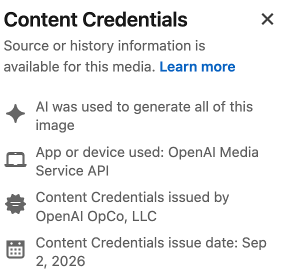
The little CR on the original image didn’t appear until after I downloaded it. LinkedIn will sometimes add the CR to an AI-created image. You can then click it to learn more. Personally, I don’t like them. It’s more distracting clutter.
But, but, but! It was free! It took only two minutes!
Yes, I hear you. But seriously, if the company had contacted us to make this image, we would have done it in less than a day. Once complete, the company wouldn’t have had any edits — and certainly no typos.
While the company did fix the image and repost it, I still shake my head when I think of the damage done while it sat there on LinkedIn for half a day.
And, it bothers me that the company is relying on Generative AI to create these messages.
To attract skilled and smart Gen Z workers, manufacturers have to be at the top of their marketing game. Posting slop like this is not the way to do it.
Agree? Disagree? I’d love your thoughts.



Tom Ahern
You two did good
Dianna Huff
Thank you, Tom! That means a lot coming from you.