I put myself through college making sails for sailboats in the San Francisco Bay Area. It was a natural progression; I was already doing boat maintenance for a boat dealer nearby on the Oakland Embarcadero waterfront.
When I first started, I swept the floor and cut the material for the “patches” that were added to the corners of the sail: clew, tack, and head. The patches were made of heavy duty Dacron and were added as layers in order to ensure the ring didn’t pull out of the sail while under power.
In the photo above of a jib’s clew, you can see this area is heavily reinforced. Cutting patches was one of the first jobs given to anyone starting out in sailmaking. Although lower on the skill scale, it was an important job.
One day, the production manager called me to his office.
“I wanted to commend you for doing a good job,” he said. “I’ve been watching you for several days; you always take the time to do something the right way. You return tools to a work area, and clean up once you finish something. You pay attention to detail.”
Text boxes: Padding and alignment
I’m not sure where my attention-to-detail comes from, but it has served me well. It has its negative side, however, such as when I see the lack of it on websites. Seeing something poorly done — especially web design for which someone has paid — makes me mad.
For example, I found this configuration of three boxes on a SaaS website. If you don’t have a background in design or coding, your eyes would simply skim over these boxes and not notice the misalignment.
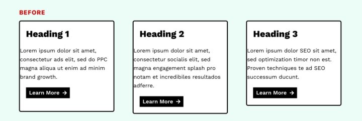
One reason the boxes don’t line up may be due to the designer using a website builder plugin. Because they’re so bloated with features and code, builder plugins take a great deal of time and expertise to ensure everything is coded properly.
It could be the designer was lazy and didn’t care, or he/she didn’t have the experience to ensure alignment, proper padding, etc.
Behind the scenes . . .
Our designer, Rachel Cunliffe, redid the boxes to demonstrate proper alignment:
- Notice how the titles and text are aligned and centered; “padding” is the space between the text and sides of each box.
- She also rounded the corners of the buttons and removed the arrows to eliminate clutter.
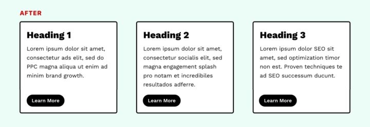
Can you see the difference? Here’s the full image to make it easier. The top line shows the “before” and the bottom line her fixes.
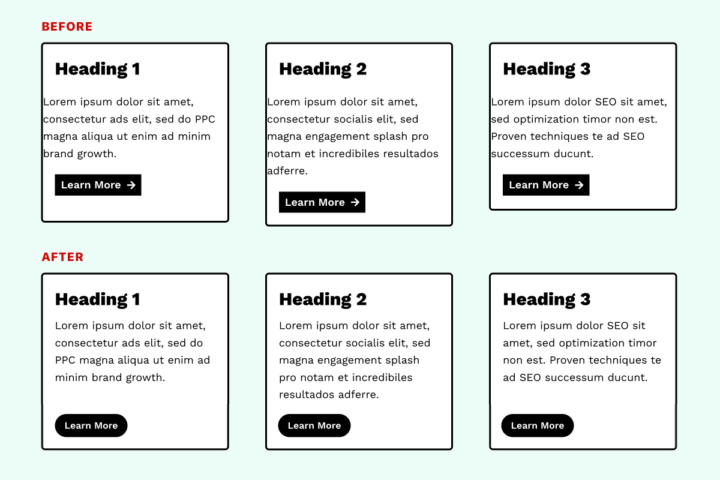
What I immediately noticed is how “calm” the “After” boxes looked. Another person said, “The bottom row is more visually appealing and less aggressive.” (Interesting word choice!)
Now you understand why we obsess over details like this — and why our Custom Build Websites don’t have that frenetic look and feel you see everywhere online today.
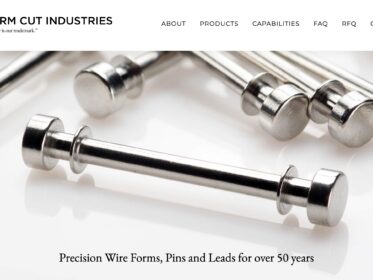
Our attention to detail is the same as yours. In fact, the manufacturers we work with are similar to us: they obsess over every little detail and look for any tiny defect.
Our goal is to ensure your website and follow-on marketing communicate the care and attention you put into your work — because we put in the same time and attention with ours.