A mega menu is a large, rectangular menu option that’s particularly useful when you have several product lines. Mega menus eliminate the much more carefully coordinated mouse movements associated with traditional drop-down menus with fly-out submenus.
Rather than have each product line listed in the top navigation and the associated information “hidden” in a drop-down, a mega menu lets you group products and their associated information — allowing users to see everything with one tap or click.
For example, Bugeye Technologies, manufacturers of flight simulation hardware, uses a mega menu to display its products by aircraft type (fixed wing, rotorcraft), as well as adding an “Other” column for the various products that aren’t aircraft specific (e.g. cockpits, controls for the Abrams tank, etc.).

Mega menus also free up valuable top nav real estate, an important consideration when employing a “sticky nav,” that is, the top nav remains in place as the user scrolls down the page.
As website designers, we like to keep top navs to seven menu items or less. Why? Primarily, it reduces overwhelm when deciding what to click on. It also ensures main menu items will be visible and fit across the screen on desktops — without needing to hide them behind a toggle button or wrap them onto multiple lines, which is also confusing.
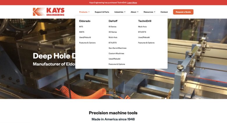
Example: Kays Engineering — Products Mega Menu
Kays has three deep hole drilling machine product lines. Using a mega menu allowed us to display the three lines by their brand names, plus the machine models associated with one.
Kays Engineering – Sticky Nav
As the user begins scrolling down the home page, the top navigation remains in place, allowing access at any time — without having to scroll back up.
A sticky nav is a great example of a good user experience: you’ve removed a minor annoyance or “friction” while helping users to easily self-select what they’re looking for. This way, they can quickly determine, “Yep, this is the company I need” and can go straight to the RFQ form.
Creating the Top Nav
Before we begin work on any new website, our web designer, Rachel Cunliffe, and I first plan out the proposed site map.
The first step is deciding the top nav; the constraint of seven nav items — six if a Request for Quote button will be used — helps us make tough decisions about what’s important, and what’s not.
To save valuable space, we never add a Home button. Why? Because clicking / tapping the logo takes users to Home. Adding “Home” to the top nav is redundant.
Once we have the proposed site map, we run it by the customer for approval and then begin developing content.
For me, creating the site map is challenging because it’s here that I think through the structure of the website: it’s the roadmap for the content and for the design.
In much the same way Apple has intricately woven its device software and hardware to deliver an exceptional user experience, so too is the content and design of a Huff Industrial Marketing website.
And it’s why, when people view a manufacturing website created by us, they see the difference immediately — and why a Huff Industrial Marketing website is the Gold Standard for manufacturers.
If you’re considering redesigning your website, view our Custom Build Website service pages to learn how we can help you.
Filed under: Behind the Scenes