Working with Rachel Cunliffe, I’ve become a student of the ebb and flow of the design process.
Design work can be such an emotional process. A client will see the first mock-up for a new website and be surprised — sometimes in a good way, sometimes not so good.
Those first mock ups are a little like getting a new hairstyle. You’re so used to seeing your old website it can hard to see the possibilities in the new proposed design.
For some reason, design (good and bad) affects us viscerally. Design communicates emotion and intent. It can speak volumes in a way that words sometimes cannot.
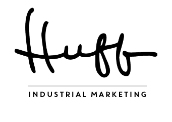
I went through such a process these last few weeks while working with Rachel to create a new logo for my business, Huff Industrial Marketing.
Since we’ve worked together a while now, and since we have multiple projects running at any given time, we communicate almost daily. So it’s safe to say she knows me really well. The benefit of this is, I don’t have to give her much direction when she designs stuff for me.
What I wanted: A “non-industrial” logo
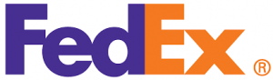
Business logos speak volumes about a business, I think. They say what the business is about in a few seconds. Logos can become iconic, such as the FedEx logo with its “hidden” arrow.
I knew I wanted my logo to say what I do clearly and succinctly. I wanted it to be true to who I am as a marketing consultant: transparent, fun, full of energy, and trust-worthy.
I didn’t communicate any of this to Rachel. Instead, I said, “I don’t want it to look industrial.” My unspoken request was, “Don’t use a crane or a pipe wrench.” 🙂
Behind the scenes . . .
Rachel’s first pass was good, but it wasn’t at all what I was expecting. She used a variation on my signature, something I hadn’t even considered.
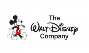
At first, I didn’t like it but after looking at it for a while, I thought, “Hmmmmm . . . ” and sent her Disney’s logo. She responded with two other “signature” logos, one of which was Ogilvy.
We spent a day or so going back and forth on the signature logo, and perhaps she sensed my hesitation, because I then received an update with concepts she had initially created but hadn’t shown me.
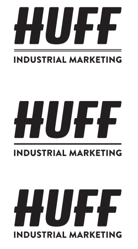
One of those concepts, the fourth one in the image above, hit me. “That’s it!” I said out loud when I saw it. Total fist pump moment!
The font treatment felt racy, strong, and energetic — a correct impression as Rachel later informed me the font is called “Triumph,” which immediately made me think of the sports car.
We then went back and forth on whether a line should be placed between “Huff” and “Industrial Marketing” and should the “Industrial Marketing” or the “Huff” be a different color.
I decided against a line because it seemed to me the line placed an invisible barrier between “Huff” and “Industrial Marketing” and I didn’t want that division. Rachel recommended the “Huff” be in black. I decided on all black for the logo as it’s clean and bold.
What I (re)learned: Be open to the process
Each time I go through a design process with Rachel, I learn quite a bit.
I learn why my clients might hesitate in saying they don’t like an initial design.
I learn that instead of saying, “Hmmm . . . that’s not quite what I was expecting . . .” to communicate what I was expecting. (I’m still learning how to do this effectively so that it helps Rachel.)
But the one big thing I learn, each and every time, is to be open to the flow of the process.
It’s this process flow I’m learning to communicate to my clients so that they can move through it with joy rather than anxiety — and with the knowledge that in the end, the design will communicate their message clearly and succinctly.
The design process is emotional and sometimes it can get a little personal (or feel that way, anyway), but it’s also a process. The more you communicate with your designer and be open to the process, the better your final result.
As part of our Custom Build Website process, we often update clients’ branding — including designing a new logo.