When over 70% of your website traffic comes from business people at work on their desktops, website navigation is hugely important.
You don’t want to waste people’s time. You want them to quickly find what they’re looking for. Within a week of using Matomo’s Heat Map tool, we could see how important the top navigation is to a manufacturing website.
Why? Because people use it to find what they need (namely, Products / Services) — without scrolling to see what else is on the page.
The issue, however, is that many WordPress theme designers have eliminated the top navigation and have replaced it with the hamburger icon.
The hamburger icon is used to denote the menu when users view a website on a mobile device, such as a phone or tablet. It gets its name from the three horizontal bars which comprise it.
Users tap it to open a large drop-down menu. The screenshot below is from my iPad.
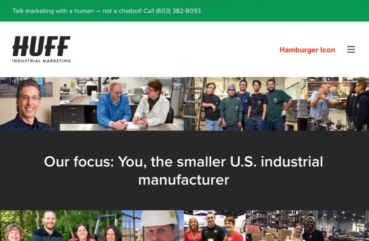
Not everyone knows what the icon is or how it works. The other problem is that it goes against website usability standards for desktop.
Replacing the standard top nav with the hamburger icon confuses people — which in turn reduces RFQ form conversions and/or leaving the website altogether.
Recommendation: Stick with your standard top nav. It works!