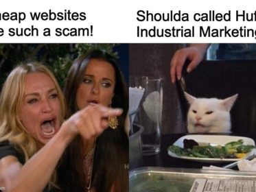
A manufacturer asked that we quote a new website. I had several calls with the sales team and the CEO and everything looked and sounded good. I sent the proposal; a few weeks later, the CFO emailed to say, “We don’t pay for ‘Discovery.'”
What he meant was, they didn’t want to pay for my team and me to do the upfront work of getting to know the company, its people, sales process, industry, etc.
Our Discovery process is quite thorough. It’s also the basis for the Strategy and Messaging — which is, in turn, the basis for the Original Copy and Design. It’s why we position our Custom Build Websites as being the foundation for ongoing marketing that drives lead generation.
I wrote back to explain this to the CFO, but . . . crickets. Several weeks later, the company had a new website.
When reviewing the new website, my designer Rachel Cunliffe and I were aghast at the number of errors we saw — and that this project had been overseen by a large agency with lots of glowing reviews.
Surely the CEO hadn’t given this website the green light? I gave the team the benefit of the doubt — maybe they needed to make the website live super fast and would go back and fix everything.
Ah, nope. After two months, the errors are still there. Going through them again, I realized the agency didn’t spend a lot of time learning about the company, its products, or the industries it served.
Even worse, it’s apparent no one on the team did a thorough proof before go-live. What follows are some of the errors we found.
“Industries We Serve”: Blank pages
The home page has a huge callout to the various industry pages where the company’s products are used.
When you click the links, however, many of the resulting pages are blank. Several of the industry sections have no copy whatsoever — as in ALL the pages are blank. Wow.
“Industries” is also missing from the Main Nav. (Maybe because they don’t want to call attention to the blank pages?)
“Case Studies”: Wrong copy
The copy to get you to the case study page says, “Read how we’ve helped create tailored solutions . . . .” When I clicked through to the page, I started laughing.
The header reads, “Case Study #1.”
The two sentences of page copy talk about the company’s distributors.
Case Studies is also missing from the Main Nav.
“Careers”: Filled me with despair
The common narrative within manufacturing is how hard it is to find and hire skilled people. The current workforce is aging out; younger people don’t want to do “dirty” jobs.
This is one reason why I recommend to manufacturers, when my team and I create a new website, they bring in a good industrial photographer to take photos of the people at work.
One, the photos show potential new hires that the facility is very clean, often high tech, and an interesting place to work. And two, they see the people who work there — aka their potential co-workers.
I also recommend manufacturers create a Careers section listing job training and benefits, employee testimonials, and Open Positions.
For this manufacturer, the agency created a huge callout to Careers on the home page. When you click through, however, you see this image and copy. Gah! So bad.

My Gen Z son gives me a lots of great feedback about how he views business and industrial websites. He’s very impatient with things that don’t work properly or look fake. He’d take one look at this page and leave — because he could see in an instant this company wasn’t serious.
Seeing this image also made me despair. Whoever made this decision has NO CLUE about manufacturing or how to attract prospective new hires.
Lots of little errors
Creating a new website from scratch involves a ton of small details — of which business owners aren’t aware. I don’t even bother telling owners we take care of all this stuff — we just do it. It’s our job.
When the electrician was here at my house a few months ago, for example, I didn’t follow him around asking all kinds of detailed questions. He’s a good electrician; I trusted him to do his job and that everything would be to code. (He even fixed a few things the last electrician didn’t do properly.)
So for this manufacturer’s website, all the little details, that we normally take care of in the course of the build, jumped right out at me, such as the home page title tag, which reads, “Home page.”
Or, the Product Search page which (still!) has this funny number in the header.

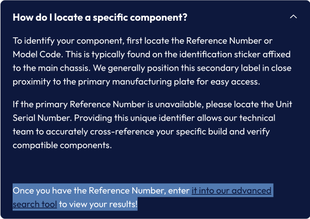
And, the hidden link text because the text links are the same color as the background (we changed the copy on these to protect the agency).
Here’s the hidden text highlighted:
The two images above are also a good example of poor design with regard to reversed-out text — which is incredibly hard to read due to low contrast. (It’s why we don’t do “dark mode” websites.)
Years of reader comprehension surveys have concluded that low contrast between text and background lowers reader comprehension to zero.
“Zero reader comprehension” means no one is reading your copy, and if they do manage it, they don’t understand it or remember it.
Even worse is dark text on a dark background. We also changed the words of this copy but basically, this is what it said — or didn’t say. It’s pretty bland and yucky.
Suffice to say, this website is a GREAT example of what happens when you let an agency with zero manufacturing experience oversee your new website build and use writers who lack manufacturing writing skills and knowledge.
What makes me sad, however, is that the agency didn’t care enough to fix the multitude of errors before or even after go live. And, because these errors are still live, I’m guessing the sales team isn’t using the website to help sell products — which is one of the main jobs of a website.
Even worse, the company will never know the number of people who didn’t contact them because of the errors.
Bottom line: What this website really says, is, “Despite what we say, we don’t pay attention to detail and the products we sell you might be pretty shoddy, too.”
But hey, at least they didn’t have to pay for Discovery!
The Huff Industrial Marketing Difference: 100% Attention to Detail

My team and I oversee each Custom Build Website start-to-finish, including strategy, messaging, writing copy, etc.
We sweat the small stuff, and it shows in our day-to-day work.
The website we build for you becomes the foundation for your ongoing marketing; therefore, we ensure it clearly and effectively tells your story by incorporating your values, attention-to-detail, expertise, etc.
We bring this expertise and drive to every website we create. Together, we ensure your website is flawless, tells your wonderful story, AND delivers the results you want.
Without this foundation, all subsequent marketing is simply throwing good dollars after bad. It’s for this reason we put considerable time and energy into each website we build — because we want to see you succeed.