 After two long years of saying, “I need to update my website!” I’m finally in the process of doing just that. The reason for the update is simple: my business has changed and I wanted my website to reflect that change.
Instead of taking shortcuts and rushing the process — which would be easy to do because one, the website is for me, and two, this is what I do for a living — I decided I would follow the same exact process I use with my clients.
This meant I had to put the fun stuff on hold and begin with the more tedious and time-consuming task of creating the Project Strategy Brief.
A successful outcome begins with a strategy
Redesigning a website can sometimes get a little intense. You have multiple people and their inputs and ideas, plus the fact that what one person thinks is “fantastic!” another person thinks is terrible. You also have a lot of misinformation and hype floating around out there — and people bring this mis-information to the process.
Hence, if you’re not careful, a website redesign project can go to hell pretty fast; it’s a painful process which the guy behind The Oatmeal documented in his clever way. Read it. It will save me from having to explain it all.
At any rate, to keep projects on track, and to make sure everyone involved is on the same page, I now create a Project Strategy Brief before any work is done in creating a new website.
The Project Strategy is a full on document that includes a ton of information gleaned from numerous interviews with the client team, the factory tour, and industry and competitive research. Depending on the client and the project, each Brief contains:
Company overview — History of the company, products and services, etc.
Competitor overview — I look at the client’s competitors, their websites, messaging and positioning, SEO, marketing, and anything else I can find.
Target audience — The people the client works with; who they are, their challenges, how the client helps solve their challenges, etc.
Sales process — This is where I spend a great deal of time. I want to know how the entire sales process works from beginning to end, how long it takes, the sales challenges, objections or push back heard during the sales process, etc.
What makes the client unique — Another area where I spend a great deal of time. I ask every client a very simple question: What makes you unique? Why should people do business with you?
Website objectives — In other words, what exactly do we want to achieve with this website? Most everyone has the same answer, “More inquiries,” but in the last couple of years, I’ve worked with clients to see if we can solve other challenges as well, such as improving customer service, hiring employees, etc.
Positioning and messaging — This is the heart of the document, and without it, projects tend to go off track very quickly. It’s really important that everyone agree what are the key messages and why, and how they’ll be communicated — both through the use of words and images.
Sitemap — And finally, based on all the information already listed, the proposed sitemap. This often changes somewhat as I begin writing the copy and after the site has been coded, but having a good idea of the sitemap upfront gives the copywriter (in this case, me) and the designer an idea of how to structure the content. It’s also is important because good navigation calls for six or fewer elements in the main nav — so how will we fit everything in this limited space?
Rachel Cunliffe of Cre8d Design then reads both the Project Strategy and all the content I create before she begins any work on a website redesign project.
The process of moving from wireframes to the fun stuff — images (yay!)
One of the first steps Rachel does is create wireframes. She does this because it allows clients (and in this case, me!) to focus on the structure of the website versus the “design,” which is where many projects are often brought to a halt as people work through conflicting opinions.
In Figure 1, you can see Rachel’s initial wireframe of the home page for my new website; the wireframe is based on the information in the Project Strategy Brief.
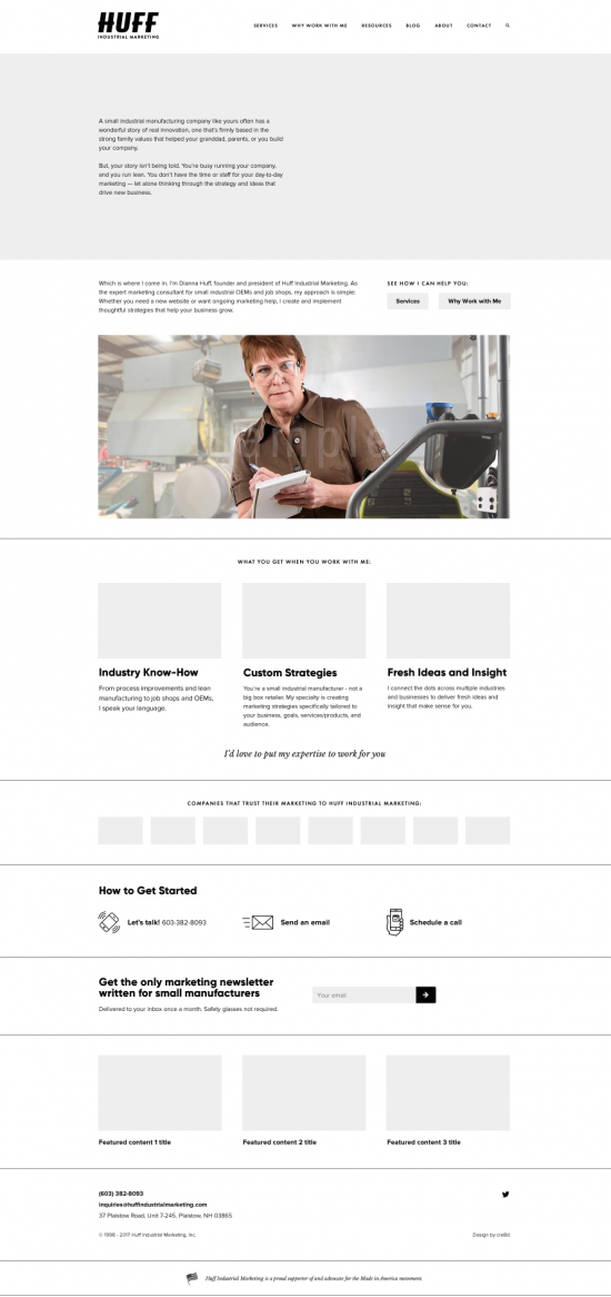
With the images (except for that main one) and colors stripped out, it’s much easier to focus on each section of the website and whether each section is adhering to my website objectives. Since I had all these written out in the Brief, it was easy to do a quick check.
Once I gave Rachel approval for the wireframe, she then began filling in the sections with design details – images, color, etc.
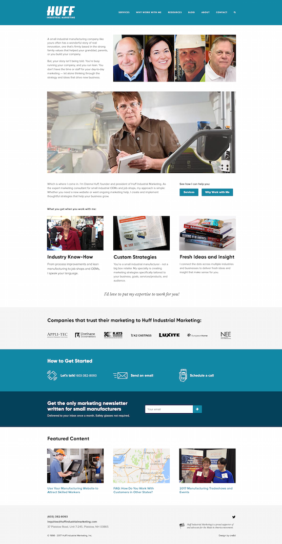
In the top section, Rachel wanted to use a photo of me with a client, but I didn’t have anything suitable, so I suggested a collage of client photos — an idea she loved. Plus, photos of clients would look so much more natural than stock ones.
Figure 2 is her first iteration — which I didn’t love. I didn’t like the color band across the top or my logo in white. The photo collage, with four photos, wasn’t exactly what I had pictured in my head.
Sometimes, clients panic at this first design iteration — because they think the designer doesn’t “get” what they’re trying to communicate. But what’s really happening is that we all have preconceived notions of what the new design will look like — and of course, the designer can’t see into our heads.
To help clients through this process, Rachel provides a brief document which explains how to provide effective feedback to her. The document talks about how to explain the problem versus providing a solution — for example, “Add a red line here” or “Change the layout this way,” etc.
It also helps to work through one issue at time. We went back and forth a few times on the color bands and font colors, and got that all sorted. Rachel also created a revised photo collage, which I loved.
However, I was having a very hard time with that photo of me! Something about it was “off” but I couldn’t figure out what.
This is where a website redesign can become a little emotional or intense. Why? I think it’s because color, fonts, and images of products, and especially people, communicate so much.
We instinctively pick up on cues in the images and even with colors — but we don’t know how to articulate what about these things is “bothering” us.
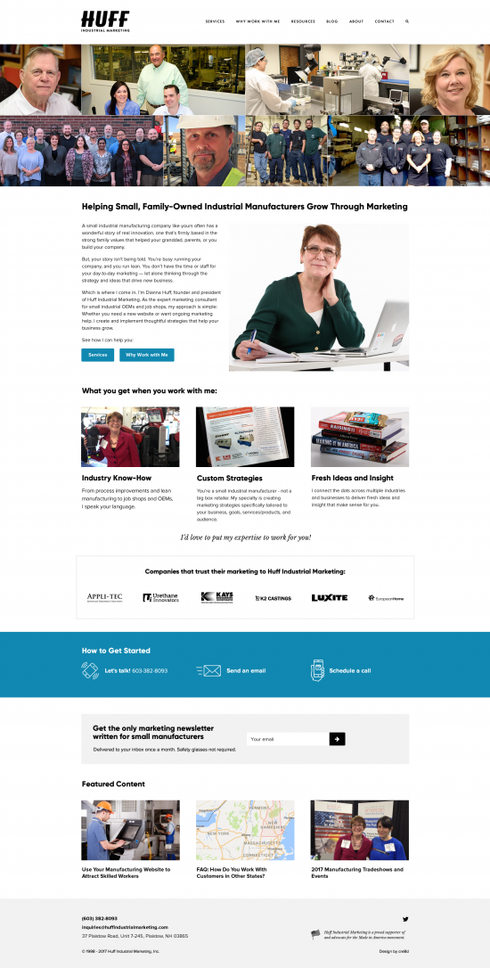
After re-reading my Project Brief, I said to Rachel, “That photo of me isn’t communicating my story and it doesn’t match the copy on the page. Why am I holding a notebook? Why do I look so intense? What is happening in this photo?”
Even though we’re 9,000 miles apart, I can always hear when Rachel goes, “Ah!”
About a half hour later, she came back with a new version (Figure 3). As soon as I saw it, I knew she had nailed it. I emailed back to say, “Perfect! I have zero corrections.” Yay!!!
Total elapsed time for home page start to finish: 24 hours.
Taking the time do a Project Strategy Brief is labor intensive and does mean you have to cool your jets a bit before getting to the fun part of redesigning a website. However, by taking the time to create your strategy and objectives, you save a lot of time and angst over the course of the project — and you help ensure it doesn’t become a project from hell.
(The Project Strategy also makes writing copy much easier because you’ve done all the hard thinking.)
Instead of going back and forth, back and forth with design iterations, and with me thinking, “I’ll know it when I see it,” having the Project Strategy saved us lot of time — allowing Rachel to move forward with designing the rest of the website sections / pages.
Plus, we’ve set the foundation for ensuring the website will do its job once it’s complete — and that is, helping to build trust and credibility with prospective clients, which leads to more inquiries.