Design & Development
The Design Process
My designer, Rachel Cunliffe, creates preliminary wireframes once the first draft of the copy is ready. Wireframes allow her to structure the content before adding branding and other design elements.
By creating wireframes first, she and I gain a clear understanding of the layout, identify any necessary changes to navigation, and determine if additional content is required.
The design process is streamlined because much of the deep thinking happened during the Project Strategy and Copywriting Phases:
- Once the wireframes are approved, Rachel incorporates design elements such as fonts, colors, graphics, and icons.
- She then creates mockups for each page, which include all design elements and copy.
- You review mockups using the Sketch tool; you’re encouraged to provide feedback. Rachel incorporates any suggestions, and minor copy edits are added to the shared Google Doc from the Copywriting Phase.
- For any questions, you can schedule a video call with us or post a question to our team through Basecamp, our project management tool. We’re very efficient and responsive.
- You’re not limited to the number of revisions in your contract. Rachel will explore various options until we find the best fit for your brand.
- The Design Phase typically takes three to six weeks. The more timely your feedback, the more efficient the process. Once the mockups are approved, the project moves into the Development Phase (described below).
Seamless integration
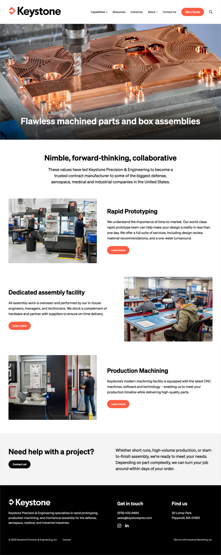
The strategy: To position Keystone Precision & Engineering as a forward-thinking contract manufacturer / CNC shop that delivers exacting attention to detail across the entire business.
The redesign focused on a complete refresh of the Keystone brand and messaging, including a new logo, as well as moving the site to a new web host.
The company was acquired in August 2024.
Why the Top Navigation is Important
We limit top navigation to seven menu items or fewer to reduce user overwhelm when deciding what to click. This constraint leads us to spend significant time thoughtfully planning navigation and user flow. Rachel and Stephen also ensure the main menu items are clearly visible and fit across the screen on desktops.
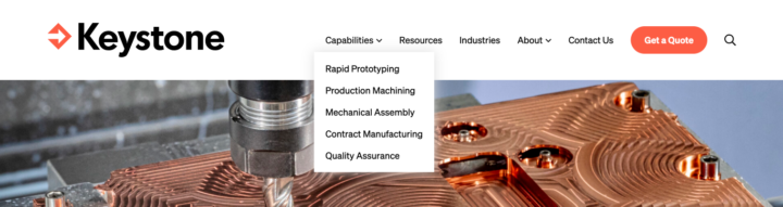
Rachel uses various design tactics to reduce friction and help users quickly find what they need:
- Sticky menu — This is where the top navigation remains visible as the user scrolls, providing constant access to key menu items.
- Left-side logo — For consistency, the logo is placed in the left corner and is clickable to return home, freeing up space for an additional menu item.
- Mega menu — This large, rectangular menu is ideal for websites with multiple product lines, removing the need for precise mouse movements common with traditional drop-down menus and fly-out submenus.
- RFQ button — This is included in the main menu so that it’s always accessible as visitors explore Products, Services, Capabilities, and more.
For ongoing marketing clients, I use the Matomo Analytics’ Heat Map tool to gather data on how people use the top navigation — and use this insight to continuously improve the websites we build — while also helping our clients improve conversion rates.
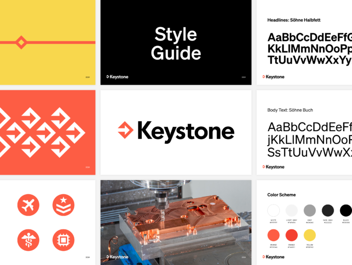
Deliverable: Style Guide
As part of the design process, you’ll receive a style guide listing the colors, fonts, and other elements used for your website.
This guide can be used for your ongoing marketing, including business cards, letterhead, and other collateral.
The Development Process
This is when the process quiets down after weeks of collaboration as our developer, Stephen Merriman, takes over and starts building.
Stephen codes all Huff Industrial Marketing websites from scratch. What does this mean?
- He installs and configures the latest version of WordPress and begins creating the custom theme based on the development notes provided by Rachel Cunliffe during the Design Phase.
- He codes each website using the WordPress Gutenberg editor. He and Rachel do not recommend or use visual website builder plugins, which are often buggy and full of bloated code.
- Stephen is incredibly thorough and precise. One thing he prides himself on is delivering bug-free, bloat-free code. It’s very clean! The code adheres to standards-compliant HTML5/CSS and conforms with Google’s guidelines. (Stephen also provides a custom User Guide tailored to your theme.)
- If the website includes special features, such as a product filter, he codes its functionality for both the front and back end, uploading databases of images and other content as needed.
- He rigorously tests the website to ensure it renders flawlessly across a wide range of browsers and devices.
- Stephen uploads the written copy, ensuring everything is formatted correctly and ready for review.
Once the coding is complete, you’ll receive a login to the password-protected development server where you can preview your fully functional website before it goes live (very exciting!). From here, final editing and proofing are done prior to launch.
In summary, everything about your Custom Build Website, from strategy and messaging to design and coding, is created based on your unique story and business goals.
The custom theme is yours — unique, beautiful, and flawlessly executed.